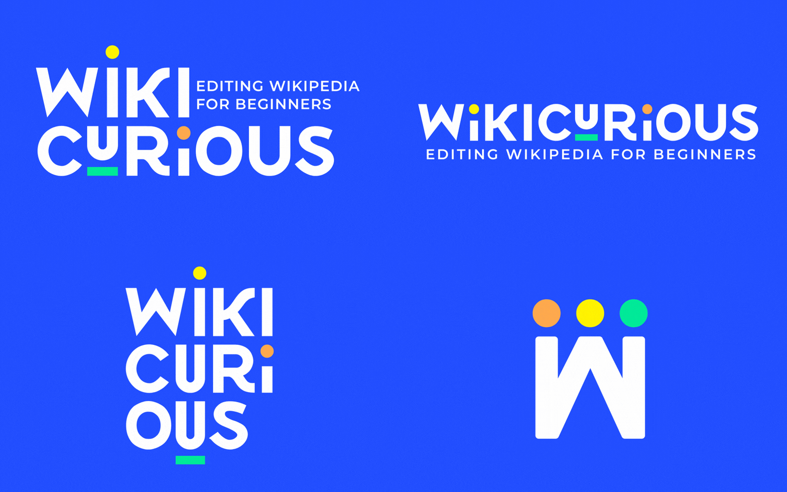
When Wikimedia NYC set out to create Wikicurious, a new initiative designed to make Wikipedia and Wikimedia culture more approachable, they needed an identity that felt just as open and inviting. We developed a playful, flexible logo system that captures the curiosity and community at the heart of the program.
Rather than relying on a single static mark, the resulting system includes multiple logo configurations that can shift with the format and context. That flexibility gives Wikicurious a recognizable visual personality without boxing the growing program into one expression.
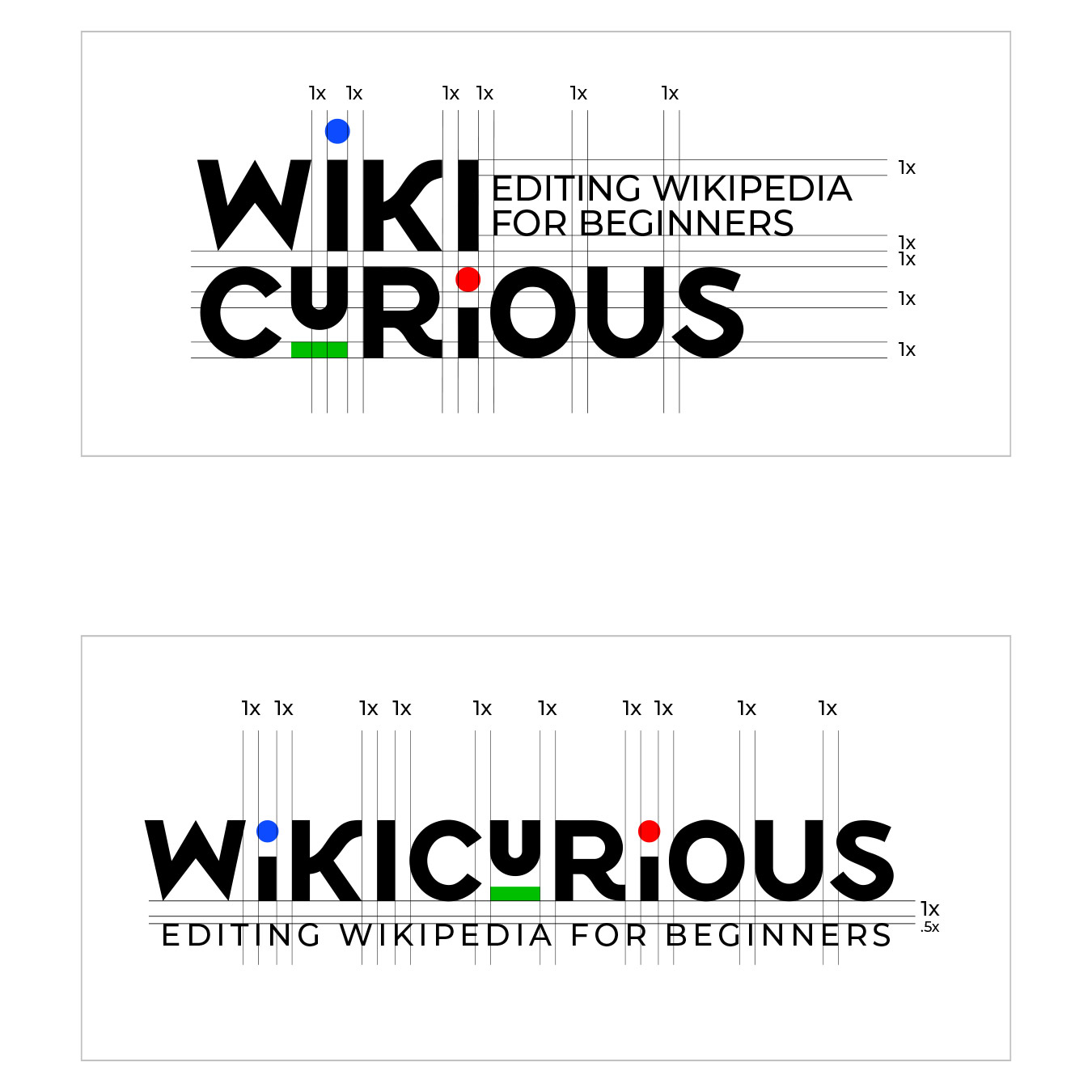
Anatomy & Meaning
WikiCurious trainings were described as “people who are excited about learning.” That idea became the heart of the design. The logo brings punctuation to life. The exclamation point with the red dot represents excitement and enthusiasm. It shares the dot with the “i” below it, creating the “thinking head” element WikiCurious is becoming known for.
The circular “head” elements draws inspiration from the Wikimedia Foundation logo, symbolically linking Wikicurious to the broader Wikimedia family while maintaining its own playful, approachable identity.
Both heads / people represent the input & output of WikiCurious, the editer and the reader. The underlined “U” highlights you, the learner. It reflects Wikimedia’s mission: knowledge that belongs to everyone, built by everyone.