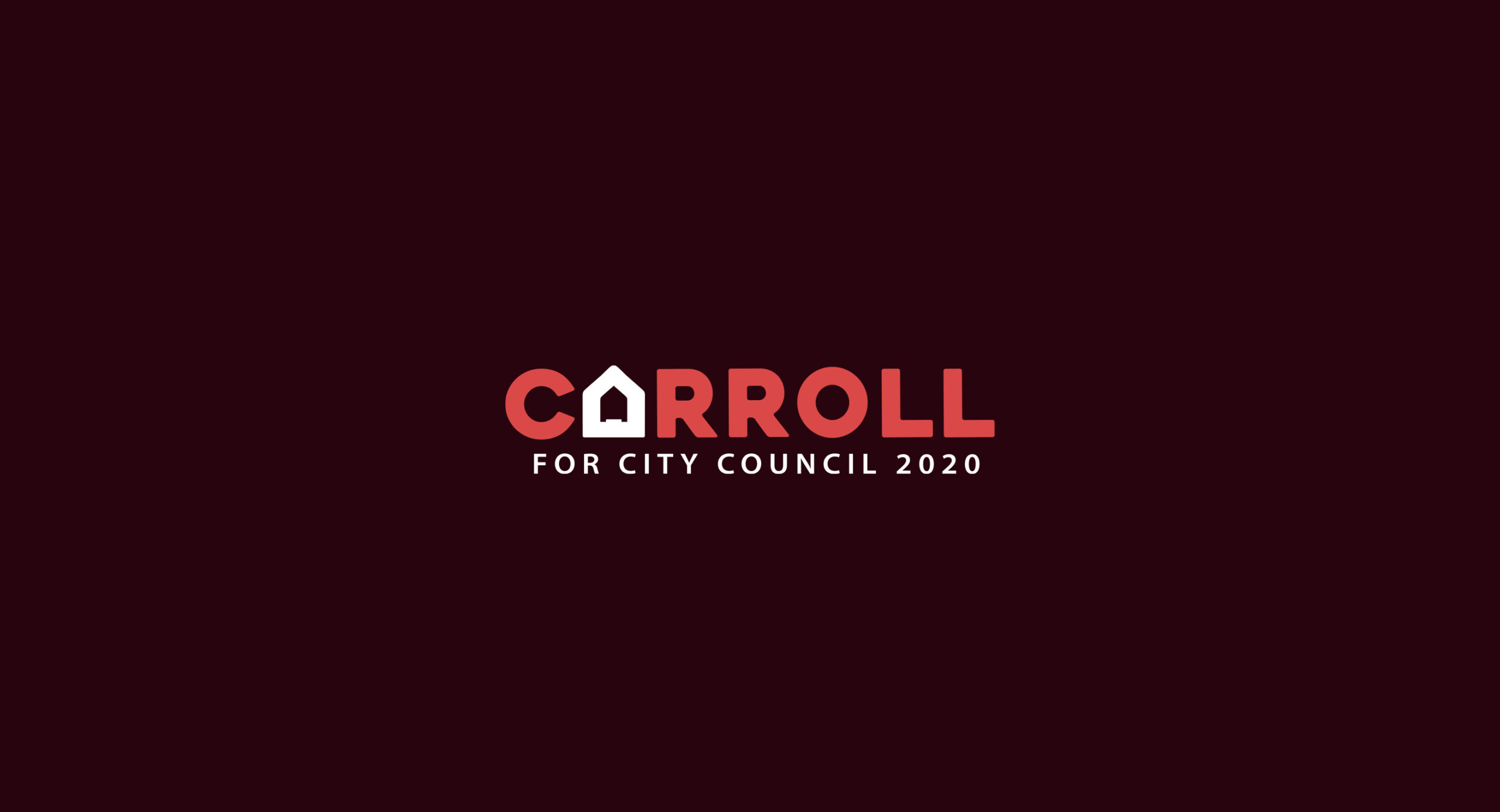
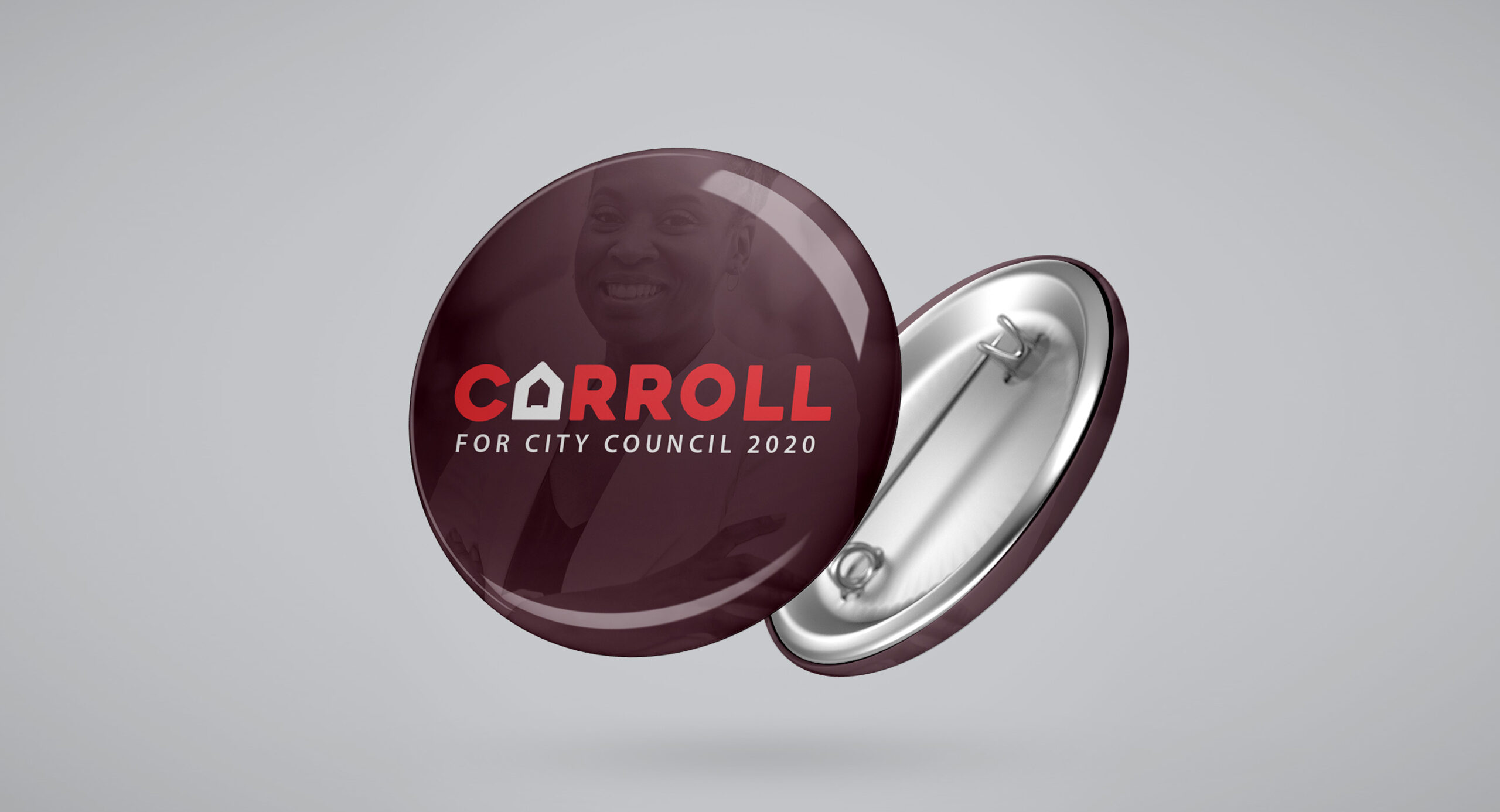
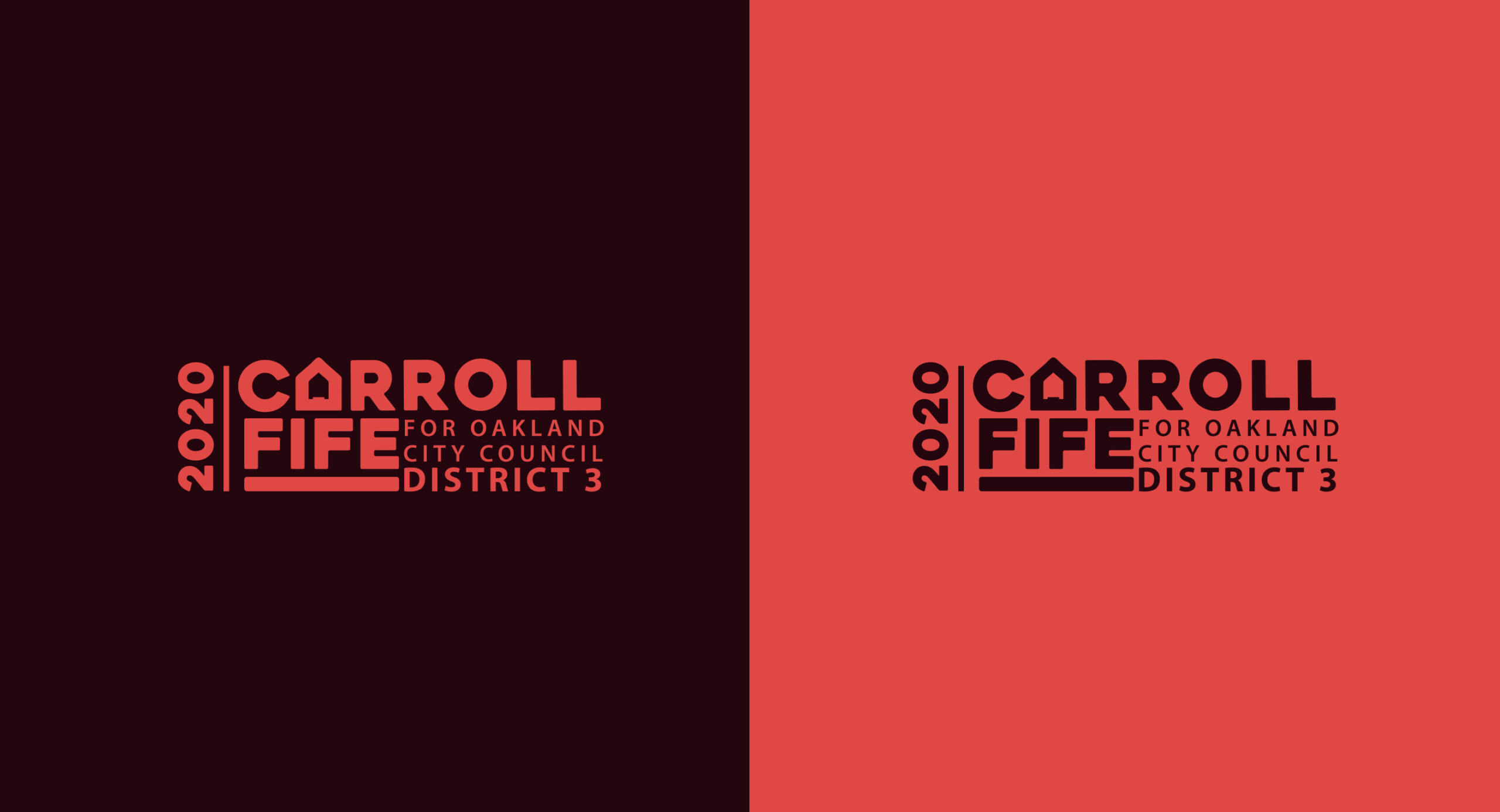
In 2020, Carroll Fife launched her campaign for Oakland City Council, and we had the honor of designing a logo that would carry both her name and her mission. The concept placed housing front and center—literally—by replacing the “A” in “Carroll” with a simple, bold house icon. This small but striking detail spoke volumes about her platform: addressing Oakland’s housing crisis with clarity, compassion, and commitment.
The house symbol wasn’t just campaign rhetoric—it was a visual nod to Fife’s years of grassroots organizing, most notably through her leadership in Moms 4 Housing, an organization advocating for housing as a human right. The logo helped make her message unforgettable at the ballot box.
(And yes, we won!)
The following social media images created by Fifes team.
